can i use
html5、css3的技术文档由W3C制定,由chrome、Edge、safari、firefox实现;这中间需要一段时间,知道一段css3代码是否被这些浏览器支持非常重要,caniuse可以解决该问题。
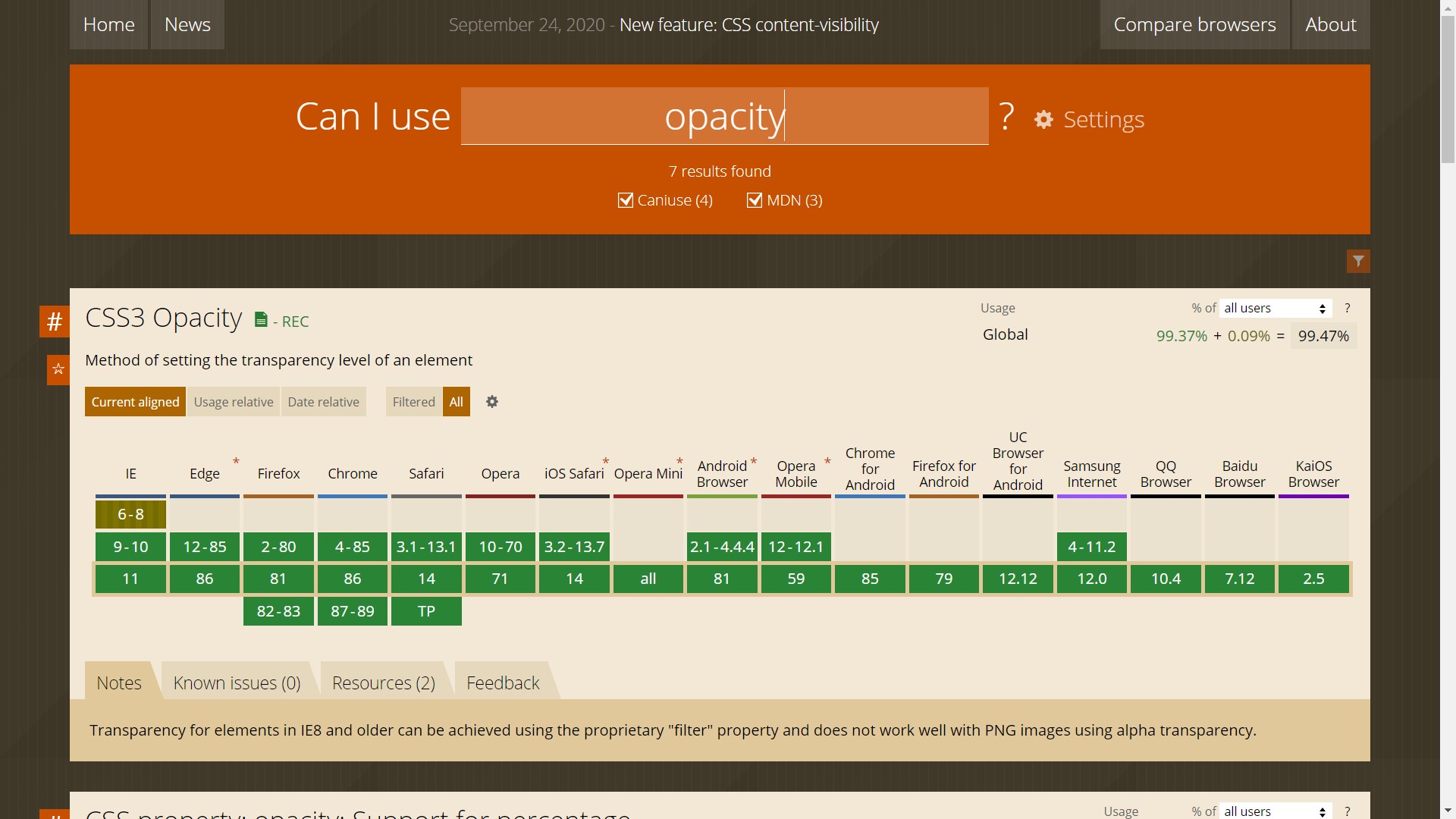
如何使用caniuse
新的属性
透明度与阴影
opacity与box-shadow
1
2
3
4
5
6
7
8
9
10
| .box{
width: 100px;
height: 100px;
background-color: tomato;
opacity: 0.8;
border-radius: 3px;
box-shadow: 1px 1px 2px #000000;
text-shadow: 1px 1px 2px #ffffff;
}
|
线性转换
css3 线性转换包括位移translate、缩放scale、旋转rotate、变形skew。
translate的设定
1
2
3
4
5
6
7
8
9
10
| .box{
transform: translate(100px,50px);
transform: scale(1.5,0.5);
transform: rotate(45deg);
transform: skew(20deg) rotate(45deg) ;
}
|
线性转换能做什么呢?
简单的立方体
1
2
3
4
5
6
7
8
9
10
11
12
13
14
15
16
17
18
19
20
21
| .cube>.top {
width: 240px;
height: 60px;
background-color: #dddddd;
transform: skew(-45deg, 0) translate(30px, 0);
}
.cube>.center {
width: 240px;
height: 240px;
background-color: #aaaaaa;
display: inline-block;
}
.cube>.right {
width: 60px;
height: 240px;
background-color: #888888;
display: inline-block;
transform: skew(0, -45deg) translate(-8px, -38px);
}
|
动画效果
animation闪烁
定义闪烁的动作
1
2
3
4
5
6
| @keyframes blink {
0%{opacity: 0;}
50%{opacity: 0.5;}
100%{opacity: 1;}
}
|
transition渐变
当用js对transiton:后的属性进行重新设定时,这些属性有自动渐变效果
transition渐变设置
1
2
3
4
5
6
7
8
9
10
11
12
13
14
15
16
17
18
19
| .box {
height: 150px;
width: 150px;
background-color: red;
opacity: 0.5;
transition: opacity 1s, height 1s, width 1.8s, background-color 1s,
border-radius 1s, box-shadow 2s;
display: inline-block;
}
.circle {
height: 150px;
width: 150px;
border-radius: 50%;
background-color: purple;
display: inline-block;
opacity: 0.6;
transition: background-color 1s, border-radius 1.5s;
}
|